
App Store screenshots that sell: what rebuilding ten store pages taught me
Conversion on the App Store is decided in about seven seconds and mostly by pictures. Here is the system I use for every app I ship, with the mistakes I made first.
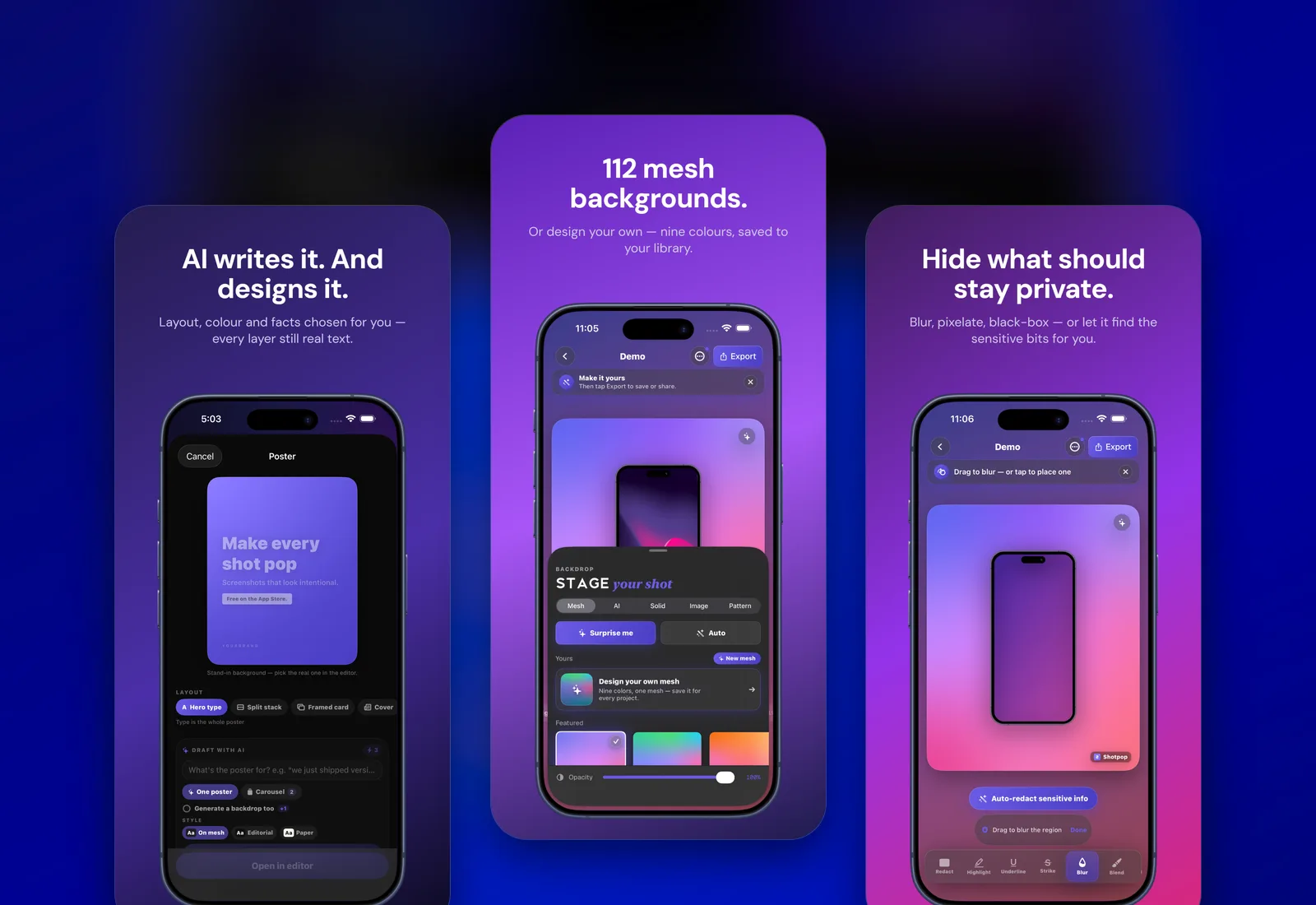
Apple gives you ten screenshots, a thirty-second preview video, a thirty-character subtitle and a description almost nobody reads. Of those, the first three screenshots do most of the work. I have watched the numbers on every app I own, and the pattern is boring in its consistency: change the first screenshot and conversion moves; change the description and nothing happens.
This is the system I now use, written down so I stop reinventing it. It's the same one I applied to Celeste on Google Play and the game on the App Store, the one ShotPop launched with this week, and the one I use for founders' apps. It took ten rebuilds to arrive at, and most of those rebuilds were me learning the same three lessons in different costumes.
One idea per screenshot, and the first one is the promise
The first screenshot is not a screenshot. It's a poster. It has one line of large text that says what the app does for the person holding the phone, and a device underneath showing that it does it. 'Make every shot pop.' 'Your stars, decoded daily.' Not 'Powerful editing tools' and not a feature list.
The test I use: cover the phone with your thumb. Does the headline still sell it? If it needs the phone to make sense, the headline is describing the interface rather than the outcome. Rewrite it.
Cover the phone with your thumb. If the headline stops working, it was describing the interface, not the outcome.
The sequence is a story, not a tour
Screenshots two to five should each answer the objection the previous one raised. Screenshot one promises the outcome. Two shows how little effort it takes. Three shows the range so the person doesn't think 'nice, but not for me'. Four handles trust: privacy, no account, offline, whatever your category worries about. Five is the moment of delight, the thing that makes them screenshot your screenshot and send it to a friend.
- Promise — the outcome in five words.
- Effort — how quickly it happens.
- Range — templates, styles, use cases, so it's for them.
- Trust — privacy, price, no account, offline.
- Delight — the moment they'll show someone.
- Six to ten — proof, edge cases, and a repeat of the promise for people who scrolled.
Device frames: real, current, and slightly tilted
A screenshot floating without a frame reads as a mockup. A screenshot inside a current iPhone frame reads as an app. It's not logical, it's perceptual, and it's worth about ten percent on conversion in my experience. Use the newest device shape. Tilt it a few degrees on the promise slide so it has energy, and keep it straight on the detail slides so the interface is readable.
Match the background to the app's own palette, not to a trend. Celeste lives in a dark violet sky because the app does. ShotPop lives on mesh gradients because that is literally what it makes. If the store page and the first screen after install look like different products, the refund request writes itself.
Text: large, short, high contrast, and localised
Screenshot text is read on a phone in a thumbnail. Anything under roughly 90pt on a 1290-wide canvas disappears. Five words per headline, two lines maximum. High contrast against the background, not a subtle grey on a subtle gradient. And if you sell in more than one language, localise the screenshots, not just the description. The game's downloads in Spanish-speaking countries doubled when the screenshots stopped being in English.
The icon is screenshot zero
The icon appears in search results before any screenshot does. Mine used to be clever. Now they are simple: one shape, one or two colours, readable at 60 pixels. Clever icons win design awards and lose taps. I stopped caring about the awards.
Measure it, then stop
App Store Connect shows impressions and product page views. Divide downloads by page views and you have conversion. Change one thing at a time, wait a week, and look. I've had a screenshot rebuild move conversion from 18% to 31% and I've had one move it from 31% to 24%. Both were worth knowing. The second one I rolled back the same day.
The preview video: worth it, in one specific case
App previews, the thirty-second videos, auto-play in search results. I resisted them for years because they're a lot of work. I finally made one for the game, because a knife hitting a target is a three-second pitch and a video shows that better than any still. Conversion on the product page went up, but the bigger effect was in search: the auto-playing preview stopped thumbs mid-scroll. ShotPop launched this week with one for the same reason; I'll report what it does. If your app's value is visible in motion within five seconds, make the video. If it isn't, a video will just be a slower screenshot.
Keep it under twenty seconds. Show the result in the first three. No title cards, no logo intro, no music that fights the App Store's silence. Record on a real device with a real screen recording, then frame it. Apple rejects previews that aren't captured on-device, and reviewers can tell.
Thirty characters that do more than the description
The subtitle sits under your app name in search results and on the product page. It's indexed for search. It's thirty characters. Most developers waste it on a slogan. Use it for the two or three words a person would type when looking for what you do, arranged so it still reads as English. 'Screenshot Beauty' for ShotPop. 'Horoscope & Astrology' for Celeste. Boring, searchable, and it moved impressions more than any keyword field ever did.
A rebuild, walked through
Celeste's first Play Store page had a beautiful hero screenshot of a birth chart wheel. Google Play rather than Apple, but the rules are identical and the numbers behaved the same way. Gorgeous, and meaningless to someone who doesn't already know astrology. Page views were fine; conversion was 14%. The rebuild replaced the wheel with the daily reading screen, a real one, with a real name and a real 'Good morning' at the top, and the headline 'Your stars, decoded daily.' The second slide showed the coach answering a question in plain language. Conversion went to 27% within a week. The wheel moved to slide six, where the people who care about wheels will find it. The lesson: lead with the moment the person will actually have, not the most impressive image you own.
I built ShotPop so that doing all of the above takes a few taps instead of an afternoon in a design tool. It launched on the App Store this week. If you'd rather have me look at your store page directly, the brief form on the front page is the fastest way.
Product builder from Surat. Ships his own apps, runs live broadcasts, and takes on a few founders a year for product, brand and growth. hey@jaybutani.com